By CJ Mitchell, Community Access Manager
As we read and take in information on social media sites, webpages, or read in magazines or newspapers, we often encounter statistical data that accompany these forms of media. This can be data taken by pollsters, researchers, and scientists. When looking at this kind of information, it can often be overwhelming to take in so many numbers. This is where data journalism comes into play, by taking information and making it more digestible. I found a definition I like in this article: “Data journalism is the use of data and number crunching in journalism to uncover, better explain and/or provide context to a news story.” Mona Chalabi is a data journalist, researcher, and illustrator who takes statistical information and creates visual representations that help viewers understand often complex information.
Ages: Grades 3–12+ (8 years–Adult)
Time It Takes: 60 minutes +
What We Are Going To Do:
- Drawing
- Data Visualization
- Reimagine or Redesign of Data
- Collage (optional)
You’ll Need:
- Data
- Graph Paper
- Pencil
- Colored Pencils, Markers
- Images of Data being graphed (optional)
- Construction Paper (optional)
- Glue (optional)
Before We Start:
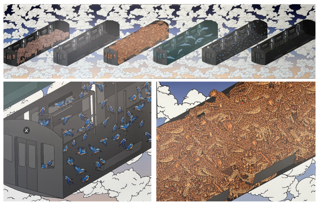
Let’s look at a few images of Squeeze, 2022, by Mona Chalabi. This is a large vinyl print that can be found on CAM’s Project Wall. Mona represents 6 subway cars floating in front of fluffy white clouds in an ombre colored sky of orange, purple, and blue hues. Inside each subway car are six types of plants or animals on the Red List of Threatened Species, as identified by the International Union for Conservation of Nature (IUCN). The threatened species include the Javan rhino, Erythrina schliebenii (plant legume), Amur leopard, vaquita (porpoise), Guam kingfisher (birds), and Hieracium kneissaeum Mouterde (perennial plant).
Think About
- What words would you use to describe how this data or information is displayed?
- What is the reference point of scale or measurement the artist is using throughout?
- How has the artist’s use of color, design, and layout affected you as the viewer?
Art Activity
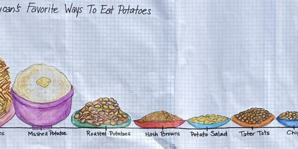
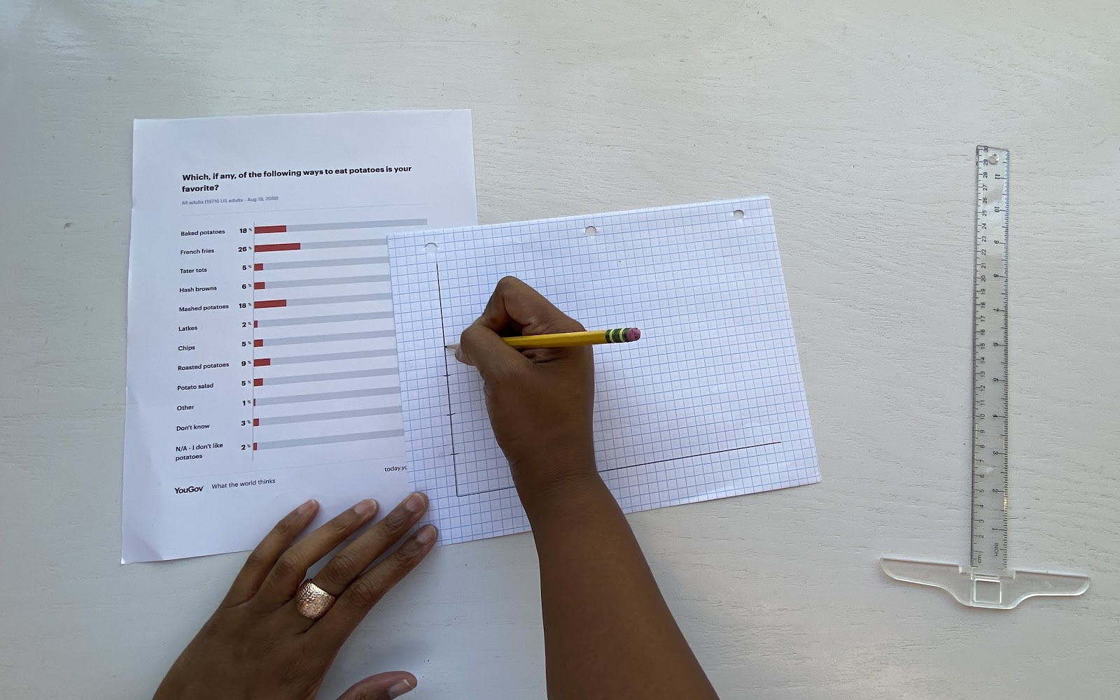
1. Begin by finding data or statistical information that’s interesting to you. I went to the website YouGovAmerica and used a bar graph survey of American’s Favorite Ways to Eat Potatoes for this example. There are other websites where you can find data listed at the end of this lesson. Your own research can be used as well, like color combinations that come in a pack of M&Ms or Starbursts.

2. Now think of a new way to display this
information. I started with looking at the largest number in my survey, which is 26, so the highest number on the Y axis (vertical) will be 30. The X axis (horizontal) will represent the different ways to eat potatoes. A ruler can be used to make the Y and X axis.
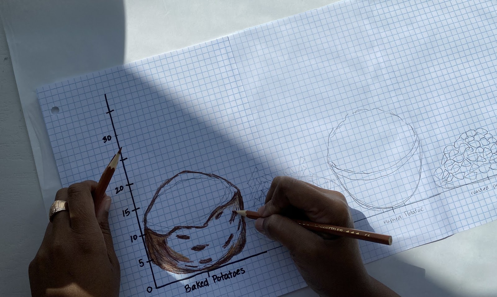
3. Think about drawing the items from your data or survey. Using graph paper to draw your items, first sketch them out with a pencil. Keep in mind the size and number it corresponds to on the Y axis as you draw. More graph paper was glued to extend the length of the paper.

4. Once everything is drawn with pencil, begin to add color to your items. Colored pencils were used first and then more details were added with markers.
5. Then you can go over your Y and X axis labels with a black sharpie or dark marker.

6. Remember to add your title. Your project is now complete.

Alternative Creative Options for Data Visualization Project
1. Use the same data from the previous example. This time, printed images will be used to make a collage in place of a drawing.

2. Cut out the images being used.

3. Then take your construction paper and glue the items you just cut out to this paper. Two pieces of construction paper were glued together to allow for more space in this example.

4. Then take a ruler and draw your Y and X axis.

5. In order to have the items in the data line up with the corresponding number on the Y axis, lightly draw lines horizontal with the X axis.

6. Lay the images out, so that placement will be correct.

7. Now glue them down.

8. Now label.

9. Now your visual take on the data is complete.

This art activity includes two examples but there are many more possibilities to redesign informational data.
Data Resources:
Graphs, maps, charts from the New York Times
Data Classroom Resource Library (email registration gives free access to materials)
United States Government Open Data
Masters in Communication Organization Website